


Document AI discussions usually focus on text. Sometimes tables. Almost never charts. Yet in financial and insurance documents, charts carry far more analytical value than people realize.
Think about the documents that drive investment decisions, underwriting, risk modeling, and board reporting. Nearly every one contains charts: revenue bridges, loss triangles, retention curves, claim development patterns, geographic breakdowns, market share shifts, sensitivity plots, factor exposures, yield curves.
Charts are not decoration. Charts are compressed data. They are the visual summary of the model that produced the document.
To a human reader, charts are intuitive. To a machine, charts are one of the most information dense, structurally ambiguous, and failure prone parts of any document.
This is the Signal Problem. Charts store meaning in geometry, color, shape, slope, and relative position. None of that survives traditional OCR or naive vision models.
How Models “See” Charts
Modern OCR and vision language models treat documents as collections of text regions or patch embeddings. This works for paragraphs. It breaks for charts.
1. Patch encoders flatten geometry
Charts are converted into small patches like 16 by 16 pixels.
Lines, bars, points, and curves are divided across patch boundaries.
Axes often split into separate tokens.
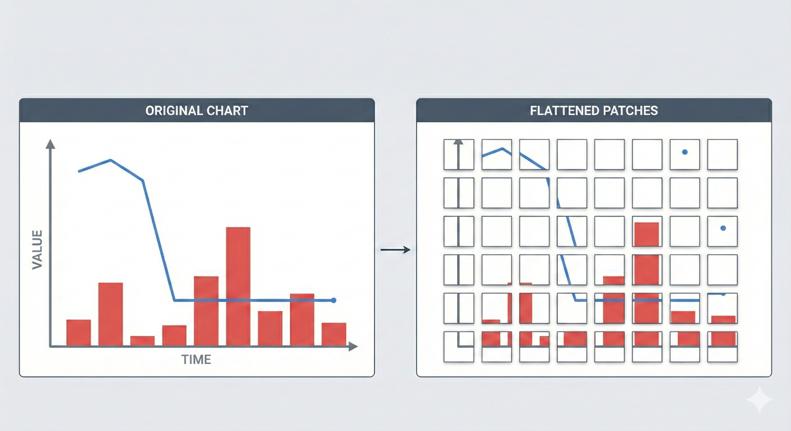
Once the geometry is split, the relationships between elements disappear. A line chart that shows a sharp drop becomes a sequence of unrelated edges. A bar chart becomes disconnected rectangles with no shared scale.
2. Semantic meaning is encoded visually, not textually
Models only see labels, legends, and axis text.
They do not see the underlying data encoded in the visual shapes.
A revenue line trending down 30 percent is not represented by text. The trend is encoded in slope. A model that cannot read slope cannot read insight.
3. Color is lost
Charts rely heavily on color encoding.
LLMs and OCR systems cannot reason about color semantics, so multi-series charts collapse into a single ambiguous object.
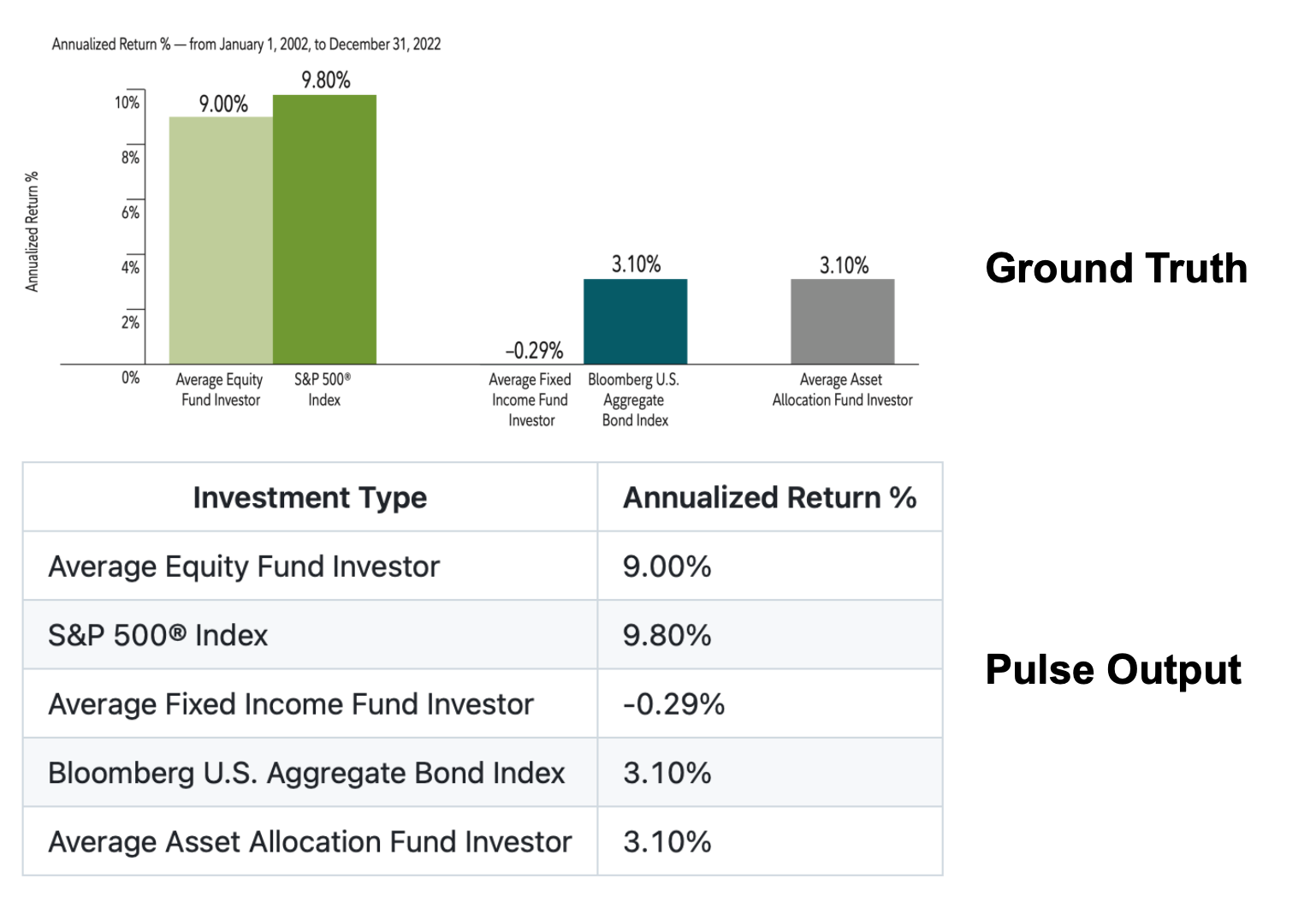
The result is simple: even when text is extracted perfectly, the data itself is not.
The Illusion of Understanding
The most dangerous failure in chart extraction is not missing text.
It is extracting the legend, axis labels, and captions correctly while losing the signal embedded in the geometry.
A machine might return:
- X axis labels
- Y axis labels
- Series names
- Title
- Legend
All correct.
But completely fail to extract the actual values implied by the chart.
This leads to a false sense of correctness. The metadata looks complete. The insights are gone.
Imagine an analyst relying on a chart showing EBITDA growth by segment.
If the system extracts only the labels and not the values, the result looks valid but contains no data. It is equivalent to removing the entire analytical content of the page.
Charts Are Mathematical Objects
Charts are not formatting elements. They are mathematical encodings.
A chart is defined by:
- A mapping from data space to pixel space
- A transformation like log scale, normalization, smoothing, or interpolation
- A set of primitives such as bars, lines, points, or areas
- A coordinate system with constraints
- A style layer that encodes grouping, category, or time
Extracting a chart means recovering the underlying data space, not the pixels.
This is the inversion problem.
The model must invert the mapping that compressed the numerical series into the drawn chart.
That inversion is fundamentally different from OCR.
Failure Modes Across Industries
The Signal Problem affects every regulated industry.
Finance
- Revenue bridges where bar height encodes magnitude
- Exposure charts where colors encode factors
- Waterfall charts summarizing value creation
- Sensitivity curves for risk models
- Multi-series line charts in research reports
- Yield curves across maturities
Insurance
- Loss development triangles visualized as heatmaps
- Catastrophe risk curves showing exceedance probabilitie
- Combined ratio charts
- Exposure accumulation plots
- Time series of claims or premiums
Healthcare and Actuarial
- Survival curves
- Hazard functions
- Clinical trial plots
- Actuarial rate curves
All compress complex datasets into visual patterns that cannot be recovered with text-based extraction.
Why Models Fail Even When Text Is Perfect
Charts break models because the essential information is not textual.
1. Geometry is continuous, not discrete
Numbers change smoothly along curves.
Models operate on discrete patches.
The continuity of the curve is lost.
2. Scale matters
Without reconstructing the coordinate system, nothing can be decoded.
A point at pixel position (400, 150) means nothing unless the axis bounds are known.
3. Visual encoding is overloaded
Color, shape, and thickness encode series or categories.
Models cannot interpret any of these visual encodings.
4. Compression destroys information
Charts are often rasterized at low DPI. Small differences between data points collapse into the same pixel region.
What Good Chart Extraction Requires
A reliable chart extraction system must treat charts as structured mathematical objects, not as decorative images.
It must deliver:
- Precise detection of chart regions and axes
- Recovered coordinate systems from pixel space
- Inference of scale, bounds, and unit
- Reconstruction of bars, lines, points, and areas
- Mapping visual primitives to the correct series
- Interpolation of data from pixel coordinates
- Handling of multiple series with overlapping color
- Deterministic outputs under the same input
It must solve the inversion problem and reconstruct the data that existed before the chart was drawn.
Minimal Benchmarks Hide the Real Difficulty
Public datasets avoid complex charts. They contain simple bar charts, toy line charts, or synthetic examples.
Real enterprise charts look like:
- Multi-series lines with overlapping slopes
- Bars with gradients
- Dotted confidence intervals
- Mixed plot types on the same axes
- Log scaled charts
- Dual Y axes
- Annotated peaks and troughs
Performance on toy charts does not predict performance on enterprise charts.
Closing: The Signal Layer Is the New Frontier
Charts are the most information dense structures in financial and insurance documents. They store the compressed signal that analysts rely on. Ignoring charts means ignoring the insight of the document. Extracting charts means recovering the underlying data that the chart encodes.
Text can be extracted. Tables can be reconstructed. Charts must be inverted.
Until the Signal Problem is solved, document AI cannot claim to understand the documents that drive real decisions.

