Charts are some of the most valuable objects inside an enterprise document, and until now they have also been among the least usable. A financial report may contain a decade of performance in a line chart. An engineering study may place the result of an entire experiment inside a scatter plot. A scanned well log may preserve measurements that cannot be found anywhere else. In each case, the document contains the data visually, but conventional extraction systems return little more than the title, legend, and surrounding text.
Today, we are releasing Pulse Agentic Chart Reconstruction to the general public. The system has been running in beta with a group of leading oil and gas companies, where teams have used it to recover structured data from historical well logs and other technical records. It is now available through the Pulse platform and API for line, scatter, bar, pie, donut, and well-log charts.
A chart is data, not an image
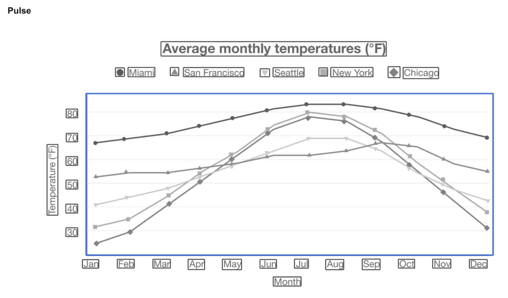
OCR is designed to recognize characters. A chart stores most of its meaning somewhere else: in the height of a bar, the slope of a line, the angle of a segment, the position of a point, or the relationship between several curves on the same axes. Reading every visible word correctly does not recover any of those values.
The problem becomes harder once a chart has been embedded in a PDF, printed, scanned, photocopied, compressed, and scanned again. Thin lines blur into grid marks. Similar shades collapse toward the same gray. Tick labels become too small for a full-page OCR pass. Several series may overlap or cross. In historical well logs, the curves can run vertically for thousands of depth measurements while scale labels appear on either side of a track or between neighboring tracks.
These are not unusual edge cases. They are the normal condition of the archives that matter most.
Building the models
Our research team built a training corpus containing thousands of labeled chart elements and data points across financial reports, scientific publications, technical diagrams, and historical well logs. The corpus combines programmatically generated charts with human-labeled examples from real documents, giving the models both broad visual coverage and the irregularity found in production archives.
We trained a collection of specialized vision models across chart families, layouts, visual encodings, and document conditions. The individual models are small enough to run in milliseconds and work together with Pulse OCR and our vision-language models to recover the chart's structure and values. This lets the system handle clean digital charts quickly while applying additional attention to scans, dense figures, and ambiguous regions when needed.
The result is structured chart data with the context required to use it: series names, colors, line styles, axis values, legends, and source locations.
Where the agentic layer helps
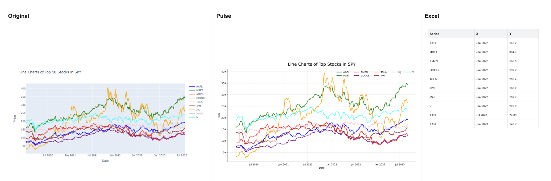
Clean charts can be processed through the fast path. Difficult charts sometimes require a closer look, particularly when labels are small, several series overlap, or a scan has lost contrast. In those cases, Pulse's vision-language model can direct the system to inspect selected regions at higher resolution and reconcile ambiguous visual context.
This quarter, our research team reached a breakthrough in that orchestration. Pulse can now generate thousands of data points from a single old log, follow multiple colored or shaded curves, and return the colors, styles, legends, and values alongside each trace. Difficult regions receive more attention without forcing every chart through the most expensive path.
From scanned well log to usable subsurface data
Well logs are where the difference between reading text and reconstructing signal is most visible. A scanned log may be perfectly legible to a geoscientist and almost empty to conventional OCR. Its value lives in continuous curves plotted against depth, often across several narrow tracks with independent scales and decades of accumulated scan noise.
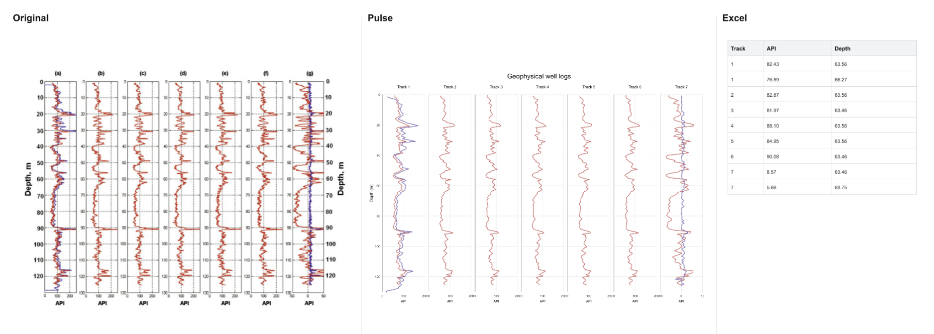
Pulse reconstructs the tracks and their measurements onto a shared depth grid. A single image can produce thousands of aligned values that are ready for analysis rather than another round of manual digitization.
The output can be returned as structured JSON or exported to Excel and CSV. For well logs, Pulse can also generate LAS files so recovered curves can move directly into the software and workflows subsurface teams already use.
Built for verification
Chart extraction is only useful when a user can verify what the system recovered. Every result remains tied to the chart's location in the original document. In the Pulse platform, users can view the source and reconstruction together, inspect the tabular values, move across a reconstructed curve, and return to the corresponding figure on the page.
The same structure carries into the API. A chart result includes the chart type, series metadata, reconstructed points, and its location in the source document. Teams can choose the number of points they need for a quick preview or a denser downstream analysis, and can request file exports as part of the same job.
Available now
Pulse Agentic Chart Reconstruction is available today through the Pulse platform and API. It supports common business charts as well as the dense, specialized plots found in technical and scientific archives, with the same deployment options available across the rest of Pulse.
The earlier generation of document systems made text searchable. Chart reconstruction makes the signal inside the document usable. For teams sitting on years of reports, scans, plots, and well logs, that turns a visual archive into data that can finally move.
Try Agentic Chart Reconstruction in the Pulse platform, read the API documentation, or contact our team to test it on your most difficult charts.

.svg)